
Check out our latest Home & Kitchen collection!
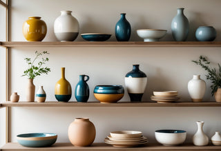
Styling shelves can turn a simple collection of ceramics into an eye-catching focal point for any room. Transforming shelves with ceramics is all about balance, thoughtful arrangement, and choosing pieces that reflect our personality. Whether we show off a few handmade mugs or a vibrant mix of vases and bowls, getting the right combo makes the space feel curated, intentional, and lived-in—not just cluttered.
We don’t need a degree in interior design to master shelf styling. With a few key tips—like mixing heights, shapes, and colors, and adding other objects to complement our ceramics—we can create arrangements that look as polished as those in magazines. Swapping pieces for the season, adding good lighting, and knowing how to protect our ceramics keeps our display fresh and inviting all year.
Key Takeaways
- A few smart styling principles help us create professional-looking ceramic displays.
- Mixing and arranging ceramics with other objects boosts visual interest.
- Lighting, maintenance, and seasonal touches keep shelves looking their best.
Key Principles of Styling Ceramics
Styling ceramics isn’t just about plopping items on a shelf and hoping for the best. With the right approach, our displays feel cohesive, dynamic, and uniquely ours.
Balancing Shapes and Heights
We want our shelves to look collected, not chaotic. Mixing tall vases with low bowls, wide platters with slender pitchers, helps keep our eyes moving. If we put all short or large pieces together, one side starts to feel heavy or flat.
A simple way to check for balance is to group items by threes—try one tall, one medium, and one small. If everything’s the same shape, it all blends together. Contrasting round with angular, or smooth with textured, adds visual punch without overwhelming.
Sometimes, we use a stack of books or a riser to boost smaller ceramics. This keeps the setup from feeling too predictable. Tip: Stand back and squint—do your shapes and heights flow or clump?
Creating Visual Flow
Visual flow leads our gaze from one end of the shelf to the other. It’s about arranging ceramics so the display feels intentional, not scattered. We want the eye to sweep naturally, stopping at points of interest.
We stagger objects in a zigzag or triangular pattern. Repeating colors or similar glazes from left to right connects the arrangement. Overlapping some pieces—like a small dish peeking from behind a larger vase—adds that layered, collected vibe.
Some practical ways to create flow:
- Repeat similar colors or finishes
- Vary the orientation (some pieces facing front, some turned)
- Overlap objects slightly
Visual flow isn’t about being strict; it’s about cohesion. A little asymmetry keeps things lively and lived-in.
Embracing Negative Space
Negative space is the unsung hero of shelf styling. The empty space between and around our ceramics lets them breathe. If we cram every inch with pottery, things feel cluttered—even when the pieces are beautiful.
We use space intentionally—leave a gap between stacks and clusters. This makes each piece feel special and avoids visual overload. Sometimes, less really is more.
It helps to step back and edit. If something feels crowded or hard to see, pull out one or two objects. The space left behind draws new attention to our favorites and creates a calming effect. Think of negative space as the pause between notes in a song—it’s what makes the whole thing sing.
Choosing and Curating Ceramics for Display
Finding the right ceramics for our shelves goes beyond picking random pieces—it’s really about combining different styles, colors, and textures to create a look that feels both intentional and inviting. Focusing on variety, color coordination, and personal meaning helps us get that balanced, collected-over-time aesthetic.
Mixing Artisanal and Store-Bought Pieces
We don’t have to choose between stunning handcrafted ceramics and those mass-produced bargains; both have their place on our shelves. Mixing these adds interest and depth, letting a hand-thrown mug shine next to a sleek vase from a big-name store. We look for pieces that share similar shapes, sizes, or finishes to keep things cohesive, even if they come from very different places.
A quick tip: group objects in odd numbers (like sets of three or five) for a visually appealing arrangement. Unique, one-of-a-kind finds like studio pottery or flea market gems create conversation starters among familiar store-bought accents. It’s about teaming luxury with practicality—because not every shelf needs to be filled with pricier artisan wares (our wallets thank us).
Showcasing Color and Pattern
Color and pattern are our best tools for adding personality to a ceramic display. We start by picking a base palette—maybe soft neutrals or bold jewel tones—and build from there. Mixing solids with patterned pieces creates visual rhythm, so a polka-dotted bowl or striped jug won’t look out of place.
Contrast is essential: pair light pieces with dark ones, or put a splashy vessel against a plain background. We can even use a small table like this to keep our color mix balanced:
| Tone | Example Ceramics |
|---|---|
| Neutrals | White vases, gray mugs |
| Brights | Aqua bowls, yellow pitchers |
| Earthy | Terracotta pots, green plates |
We leave some “negative space” on the shelf, too, giving bold patterns and colors room to breathe. This stops our display from feeling cluttered or overwhelming.
Highlighting Handmade Charm
Handmade ceramics have quirks—imperfect curves, fingerprints in the glaze, maybe a tiny wonky handle—that we celebrate. These details add authenticity, reminding us that someone shaped each piece with care. We place these items in spots with good lighting so their textures and glazes stand out.
A single handmade pitcher or mug carries more character than ten identical cups. We like to stack or lean handmade plates and bowls at a slight angle, making their forms visible from different points in the room. When possible, we jot a little note or tag about the maker; it adds context and a personal story to the display.
By spotlighting these artisanal touches, we create a shelf that feels curated, not just decorated.
Layering and Arranging Like a Pro
Layering ceramics is more than just placing pieces side by side. The right combinations can highlight different shapes, finishes, and colors, all while keeping our display interesting and personal.
Grouping by Odd Numbers
We've probably noticed that displays with three, five, or seven items just look better. Designers often use odd numbers to create a focal point and prevent arrangements from feeling overly structured. When we arrange ceramics, working in clusters of three is a reliable starting point—think a tall vase, a mid-height bowl, and a small planter.
Why odd numbers?
A trio draws the eye naturally and avoids perfect symmetry, which can sometimes feel flat or too formal. This technique also helps us mix and match sizes or shapes. For instance, we might pair a round glazed pot with a matte pitcher and a textured mug for visual movement.
Here's a quick reference:
| Number of Pieces | Look & Feel |
|---|---|
| 2 | Static, formal |
| 3 | Dynamic, balanced |
| 5 or 7 | Layered, lively |
Odd-numbered groupings encourage us to experiment and make our shelf less predictable.
Playing With Texture and Surface
When we layer ceramics, playing with different textures adds depth and character. We don’t have to stick to just glossy or matte—all those contrasts help each piece stand out. Mixing a heavily textured vase with smooth porcelain cups keeps the arrangement from feeling monotonous.
To get this right, we can:
- Combine rough earthenware with glossy finishes
- Layer a crackled glaze piece next to a satin-finished bowl
- Arrange smooth and ribbed ceramics together
We also pay attention to how surfaces react to light. Shiny glazes reflect more, while matte or textured items absorb light, making the shelf arrangement look more complex throughout the day. A simple swap—like moving a textured pot forward or grouping a shiny pitcher in the middle—can change the visual rhythm of the display without buying anything new.
Combining Ceramics With Other Objects
Pairing ceramics with thoughtfully chosen items brings out their character and invites interest. We get to play with scale, color, and texture, letting each piece support the story of our display.
Adding Books and Greenery
Books aren’t just for reading—they bring height and structure to shelves. We like to stack a few, using the horizontal surface to prop up a small ceramic vase or bowl. Mixing book spines with pottery glazes adds both visual interest and a bit of color coordination.
Greenery breathes life into the arrangement and softens the hard lines of ceramics. We often reach for a trailing ivy or a modest succulent. Choose low-maintenance plants that don’t require heavy watering—water and ceramics usually aren’t best friends.
Here’s a quick cheat sheet:
| Item | Why Use It | Placement Tip |
|---|---|---|
| Tall books | Height/Structure | Back of the shelf |
| Small pots | Organic shape | Beside or atop book stacks |
| Greenery | Freshness | Near ceramics for softness |
Using Trays and Bases
Trays and bases corral smaller ceramics, making a group feel less scattered. We prefer neutral trays—wood, metal, or glass—so the ceramics remain the stars. Aim for a contrast in textures; a matte tray under glossy ceramics helps everything pop.
Place awkwardly shaped ceramics on small stands or risers to lift them up. This not only gives variation in height but also prevents the whole display from seeming flat. Trays also help contain any loose bits, like pebbles or matchbooks, keeping the shelf tidy.
Keep the mix thoughtful: no more than three to four items per tray. Grouping by color or material can help keep things feeling cohesive.
Transforming Shelves for Every Season
Our shelves set the tone for the room, so switching things up with the season keeps our spaces fresh and inviting. With a few intentional changes and the right ceramic displays, we can create a look that always feels timely but still true to our style.
Refreshing Displays Throughout the Year
We don’t have to overhaul everything just because the weather changes. Swapping out a few key ceramics can quickly update the vibe. In spring, we might bring in light-colored bowls or vases in pale blues and fresh greens. For summer, brighter accents like yellow pitchers or turquoise mugs keep things lively.
When fall rolls in, we reach for earth-toned ceramics like rich browns, deep oranges, or even matte black pieces for cozy warmth. Winter calls for a return to minimalism: think crisp white platters, textured stoneware, or metallic-glazed ornaments for a touch of sparkle. By rotating just a couple of items, our shelves always feel in sync with the season without feeling overdone.
Incorporating Seasonal Accents
Ceramics play well with seasonal touches, so we mix in other textures and small décor items. In spring, we might nestle a tiny bud vase beside a stack of pastel plates—bonus points for real blossoms. For summer, seashells, small woven baskets, or citrus fruits placed with our favorite ceramics bring that breezy, vacation vibe.
Come autumn, we like to lean into natural elements. A ceramic pumpkin or acorn, a cluster of mini gourds, or even just a bundle of dried wheat can set the mood. In winter, we’ll add evergreen sprigs in a glossy pitcher or layer in candleholders for glow. Using a simple checklist like the one below helps us keep things balanced:
- Choose 2–3 ceramic pieces per shelf.
- Add 1–2 seasonal accents.
- Include one item with a different texture (wood, metal, or greenery).
Mix and match, but resist overcrowding—our ceramics need room to shine.
Lighting Tips to Make Ceramics Pop
How we light our shelves can completely change how our ceramics look and feel. Good lighting shows off textures, glazes, and the genuine craftsmanship of each piece.
Maximizing Natural Light
Natural light really brings out the true colors and finishes of ceramics. If you can, try putting shelves near windows or in rooms that get a good dose of sun. The sunlight shifts during the day and gives ceramics a lively, inviting vibe.
Sheer curtains help soften harsh midday rays and keep glare or fading at bay. North-facing windows offer steady, balanced light, which keeps colors crisp without turning your collection into a sauna. If you’ve got deep shelves, pop a mirror at the back—it’ll bounce daylight around and brighten up those shadowy corners. Honestly, sipping coffee next to a sunlit vintage vase? That’s a win.
A few quick ways to make the most of natural light:
- Place ceramics on shelves that catch the morning sun.
- Use white or pale backgrounds to reflect more light.
- Rotate your pieces now and then so each side gets some time in the spotlight.
Choosing the Right Accent Lighting
Shelves far from windows or pieces you want to show off? Accent lighting steps in. LED strip lights work on almost any shelf and don’t get hot. Small plug-in spotlights or puck lights can zero in on your favorite items, drawing attention right where you want it.
Warm white bulbs usually look best—they highlight creamy tones without making everything look washed out. If you’ve got a dimmer switch, even better. You can switch from cozy evening glow to full-on gallery mode.
Try not to aim lights right at eye level; nobody wants glare. Instead, angle accent lights slightly above or to the side. This cuts down on shadows and really brings out the curves and details of each ceramic piece.
Common Mistakes and How to Avoid Them
Getting ceramic displays right means spotting what often goes wrong. A few simple missteps can make even the most beautiful shelves feel cluttered or off.
Overcrowding the Shelf
It’s tempting to show off every piece you love, but cramming too many onto one shelf just makes everything blend together. When ceramics are packed tight, none of them get a chance to stand out.
Give each object a little breathing room. Use negative space like it’s part of the design. It’s easier to see and appreciate each piece when you don’t crowd the shelf.
Try grouping in odd numbers—three or five works well. This feels more dynamic than lining everything up in a row. If you’re running out of space, maybe it’s time to rotate pieces with the seasons instead of forcing everything in at once.
| DON’T | DO |
|---|---|
| Pack shelf full | Leave empty spaces |
| Line up in rows | Vary group sizes |
| Ignore shelf depth | Use back and front placement |
Ignoring Color Harmony
It’s easy to overlook how much color matters. Too many clashing hues can make shelves feel chaotic. Take a look at the colors already in your room and pick ceramics that either complement or thoughtfully contrast with them.
Grouping similar tones—like all whites, blues, or earthy shades—sets a calm mood. If you love color, small pops stand out best against a neutral background.
A color wheel helps if you’re unsure. Pairing colors from opposite sides adds interest, while sticking to similar shades keeps things peaceful. Got too many bright pieces? Swap a few for neutrals to bring things back into balance.
Caring for Ceramics on Display
If you want your ceramics to look good and last, a little care goes a long way. Regular upkeep and a few smart habits protect even the most delicate pieces.
Dusting and Cleaning Safely
Dust is always lurking. We should dust pieces weekly with a soft microfiber cloth or a feather duster. For tricky spots or detailed designs, a soft paintbrush gets into those nooks without scratching anything.
When cleaning, water works if you’re careful. Use a damp, lint-free cloth for most ceramics, but don’t soak unglazed or hand-painted surfaces. Mild dish soap is fine if it’s labeled safe—skip anything harsh or abrasive.
Quick Dos and Don’ts:
| Do | Don't |
|---|---|
| Use soft cloth | Use rough sponges |
| Gentle motion | Submerge pieces |
| Air dry | Use strong cleaners |
Preventing Chips and Cracks
A good display keeps things safe, not just stylish. Space out ceramics so they don’t clink together. Stick some museum putty under especially precious or top-heavy pieces—it’s a lifesaver if the shelf gets bumped.
Try to keep ceramics away from doorways or busy paths where accidents happen. Watch out for temperature swings, too; keep shelves away from radiators, direct sun, and vents. When you move a piece, lift from the base, not the rim. It’s a small habit that can save a lot of heartbreak.
Frequently Asked Questions
We all want shelves that look tidy, interesting, and personal—without turning into a storage closet or a museum. Getting the right balance and mix of items really changes the feel of any space.
Need some tips on keeping your shelf display from looking like a hot mess?
Give each ceramic piece a little space. Leave gaps and play with different heights for a cleaner look.
Group items in odd numbers, use trays or baskets for small things, and don’t be afraid to edit out anything that doesn’t spark a little joy.
Ever wonder if there's a secret formula for shelf styling to make it look just right?
Actually, yeah—try the “rule of thirds.” Group items in threes, mixing tall, medium, and short pieces for a nice rhythm.
Mix up textures too—try glossy ceramics with matte, or add a touch of wood or metal for interest.
Curious how to make the most of those open shelves without resorting to just stacking books?
Mix it up. Display ceramics with plants, framed art, and a few books (standing or stacked) for structure.
Try turning a bowl on its side or propping a plate up on a stand to break up all those straight lines. A sculptural piece adds instant interest.
Looking to create a picture-perfect 3-shelf display that'll make your wall pop?
Start with anchor pieces—a large vase or standout bowl—on each shelf, but switch up their positions (left, middle, right).
Fill in with smaller ceramics and décor, changing up heights and shapes for each shelf. Make sure no two shelves look exactly alike for a more dynamic look.
What treasures should you showcase on your bedroom shelves to ensure sweet dreams?
Stick with calming, personal pieces—think soft-toned ceramics, favorite photos, maybe a classic clock or a scented candle.
Ceramic vases with dried flowers or little lidded jars for keepsakes help keep things peaceful and practical.
Stumped on turning that plain shelf into a visual treat with an artistic flair?
Think of the shelf as your own mini gallery. Toss in some art prints, a hand-thrown ceramic or two, and maybe a splash of greenery for a little life.
Go ahead and lean your art instead of hanging it. Stack a couple of pieces if you want more height—sometimes breaking the “rules” is what makes it work.