
Check out our latest Office & Stationery collection!
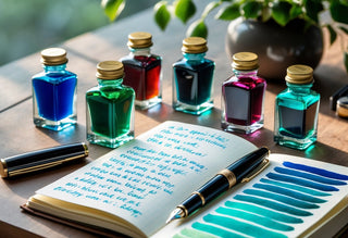
Finding the right fountain pen ink color does more than brighten up our journals—it can spark ideas and help us see our projects from new angles. Some ink colors really do stir creativity by shifting our mood and mindset. Whether we're writing stories, sketching, or just taking notes, the right palette makes the whole thing more enjoyable.
With so many shades and specialty inks out there, picking what fits us best is a creative adventure in itself. When we notice how different colors line up with our goals, we make our writing and art sessions more personal—and honestly, a lot more inspiring.
Key Takeaways
- Ink color can nudge our creative thinking.
- Picking shades that match our goals keeps things fresh.
- Playing with palettes helps us find what really inspires us.
Understanding the Role of Ink Color in Creativity
The ink color we grab isn’t just about looks—it shapes how we work and feel. When we pay attention to how different shades spark different moods, we can actually match our tools to what we want to create.
How Color Influences Mood and Thought
Colors hit us on a subconscious level, shifting our mood almost instantly. Blue inks feel calm and help us focus—no wonder they're a go-to for journaling or brainstorming. Red brings energy, maybe even a little urgency, which can help us push through procrastination.
Green is all about balance and harmony. If we're craving a fresh start or a boost of creativity, switching to green ink can shift our mindset. Even wildcards like orange or purple break us out of ruts and add a playful twist.
| Ink Color | Associated Mood |
|---|---|
| Blue | Calm, focus, reliability |
| Red | Energy, urgency, excitement |
| Green | Balance, renewal |
| Purple | Creativity, luxury, mystery |
| Orange | Playfulness, enthusiasm |
Psychology Behind Fountain Pen Ink Colors
Color theory has been around forever, and the findings are pretty consistent. Blue tones help us concentrate, while yellow and orange lift our mood and encourage creative risks—though, let's be real, too much can get overwhelming.
Our personal history shapes how we react to colors too. Maybe a deep brown reminds you of old books and sparks nostalgia. Sometimes, it’s worth just testing out a few colors and noticing how they feel for different tasks.
If we use a “correction” color like bright red for everyday writing, it might just stress us out. Being aware of these psychological cues helps us avoid setting the wrong vibe for the work at hand.
Creative Expression Through Color Selection
Ink color is such an easy way to add personality and purpose to our work. Uncommon shades like turquoise or magenta break up the routine and bring a new tone to our writing. Sometimes, just changing colors makes the act of writing feel fresh.
Switching colors in the middle of a project helps us mark different sections or moods in our notes. Some of us even match inks to seasons or our mood, turning writing into a little ritual.
There’s no one right answer—experimenting is half the fun. Mixing and matching shows off our creativity before we’ve even written a word.
Choosing Colors to Match your Creative Goals
Ink color isn’t just about looks—it can steer our minds in different directions. Pairing certain hues with certain tasks lets us shape our creative process from the very first line.
Energizing Ink Choices for Brainstorming
When we need ideas to flow, some colors just wake up our brains. Vivid reds, warm oranges, and bright yellows keep our thoughts lively and help us dodge creative blocks.
Red grabs our attention and keeps us alert—great for lists or mind maps. Orange has a friendly warmth, perfect for group brainstorming. For solo sessions, yellow stands out, though it pops best on cream or ivory paper since pale yellow can disappear on white.
A quick look:
| Color | Vibe | Ideal Use |
|---|---|---|
| Red | Bold, alert | Idea generation, edits |
| Orange | Friendly, warm | Group brainstorming |
| Yellow | Joyful, bright | Highlighting concepts |
Using these colors tells our brain: time to create, not critique.
Soothing Hues for Focused Writing
Sometimes we just need to settle in and write with focus. Cool colors like blue and gentle greens help us get there.
Blue inks almost always work for essays, reports, or journaling. They’re easy on the eyes and help us stay calm through long sessions. Soft greens—like sage or moss—bring a refreshing, low-stress vibe, perfect for outlining or revising.
On days when focus is hard to find, muted violet or dusty teal can calm the nerves and quiet distractions. These shades remind us to slow down.
Our shortlist looks like this:
- Blue: Calm and reliable—works for most things
- Green: Refreshing, steady—good for edits or outlines
- Violet/Teal: Subtle, keeps focus without getting boring
Colors That Encourage Artistic Playfulness
Sometimes we just want to have fun—no rules, just play. That’s when bold teals, vibrant purples, shimmer inks, and color-shifting shades come out.
A bright teal lifts our mood and goes great with doodles or creative prompts. Purple—especially the rich or dual-shading ones—makes playful writing sessions stand out.
When we want extra sparkle, shimmer or sheen inks catch the light and add flair to cards, notes, or sketches. Keeping a few “fun” colors handy means writing never feels like a chore.
Honestly, the wilder the ink, the better for personal projects. The more we experiment, the more surprises we find.
Exploring Popular Ink Color Families
We can totally change up our notes, journals, and art just by picking inks that fit our mood. Each color family brings its own energy, helping us express ourselves or stay on track.
Shades of Blue: Calm and Reliable
Blue ink is classic—think business memos, school notes, letters home. Deep navy and royal blue feel reliable and professional. If we want calm, softer blues like turquoise or powder blue help clear our heads.
Here’s a quick guide:
| Shade | Mood | Best For |
|---|---|---|
| Navy Blue | Trustworthy | Work notes, documents |
| Turquoise | Refreshing | Creative planning, doodling |
| Powder Blue | Gentle, soothing | Journals, personal letters |
Blue comes in so many variations that we can match our ink to any mood—a reflective morning or a high-energy session. Plus, it usually doesn’t smudge much, which is nice if we write on both sides.
Vibrant Reds and Oranges: Bold and Adventurous
Red and orange inks jump off the page and bring energy. We like these for marking drafts or highlighting key points. Scarlet, vermillion, and classic red are eye-catching, but too much can be a bit much.
Orange shades—like tangerine or burnt orange—balance energy with warmth. They’re great for editing, sketching, or when we want ideas to stand out. Here’s how we use them:
- Scarlet: Urgent to-dos
- Vermillion: Emphasis or feedback
- Tangerine: Creative accents and headers
These shades dry fast, so we don’t have to worry about smears. When we want to take bold action, reds and oranges do the trick.
Earthy Greens and Browns: Grounded Inspiration
Greens and browns connect us to nature, bringing balance and a sense of renewal. Forest green, olive, and teal-green feel sophisticated and work for mind-mapping or journaling. They’re noticeable but not distracting.
Browns—sepia, chestnut—give off a vintage or literary vibe. We love using them for botanical sketches, annotating, or just mixing up our routine. They fit in business or art settings.
Comparison Table:
| Color | Effect | Examples |
|---|---|---|
| Forest Green | Natural, refreshing | Journals, sketches |
| Olive Green | Balanced, subtle | Planning, notes |
| Sepia/Coffee | Warm, classic, vintage | Letters, art |
This group is perfect when we want our writing to feel grounded and organic.
Unusual Pastels and Brights: Standout Statements
Pastels and brights are the rebels here—they instantly lift our mood. Mint, lavender, and peach transform pages and spark conversation at pen meetups.
Bright pink, electric lime, and sky blue demand attention and make lists, art, and headers pop. They might need thicker paper and a bit more drying time, but the results are worth it when we want to stand out.
Pro tip: Layering pastels with bold inks lets us highlight or decorate. These colors aren’t for every situation, but sometimes we want our pages to shout as much as our ideas.
Seasonal and Thematic Ink Selection
Different ink colors can shift our mindset and creative energy in surprising ways. Picking inks that match the season or a project’s theme adds personality and focus to our writing.
Inks for Spring and Summer Inspiration
When spring rolls in, we reach for fresh, lively colors—leafy greens, soft pinks, sky blues. These instantly brighten our notes and sketches.
Summer calls for vibrant turquoise, coral, or lemon yellow. Even routine to-do lists feel more fun with these bold shades.
We like keeping a “seasonal rotation” of ink. Here’s a sample table:
| Ink Color | Season | Effect |
|---|---|---|
| Fresh Green | Spring | Calming, hopeful |
| Sky Blue | Spring | Airy, uplifting |
| Turquoise | Summer | Energizing |
| Coral | Summer | Playful |
Autumnal and Winter Color Palettes
When the weather cools, we pull out richer, muted shades. Copper, pumpkin orange, burgundy, and deep teal match autumn’s vibe.
In winter, navy, pine green, or smoky gray set a cozy mood. Shimmer inks that mimic frost or snow are a fun touch.
On cold evenings, we might grab a warm brown or burgundy for journaling. For planning, a cool gray keeps things focused but soft. These little seasonal changes keep writing interesting without a big overhaul.
Matching Ink to Personal Projects or Themes
Picking ink by project—or even by mood—can boost motivation and creativity. For poetry, maybe we pick violet or midnight blue for a thoughtful feel. Bullet journals come alive with color-coding: green for money, red for urgent stuff, blue for schedules.
Some ideas we’ve tried:
- Travel Journals: Sand or aqua for beach trips, forest green for hikes
- Letters: Red or gold for festive vibes
- Art Sketches: Sepia or ochre for an old-world look
Trying new color and theme combos keeps writing personal and fun. Sometimes, just swapping ink colors is all it takes to get inspired to finish a project.
Mixing and Layering Fountain Pen Inks
Playing with fountain pen inks gives us a shot at finding custom colors and fun effects. If we take a few precautions, mixing and layering inks can be a safe and surprisingly satisfying way to make our writing stand out.
Safe Mixing Techniques
When we mix inks, protecting our pens has to come first. Since not every ink plays nicely with others—thanks, chemistry—we should check the manufacturer’s recommendations or stick to mixing inks from the same brand. Pigment-based and shimmer inks, in particular, usually aren’t great for mixing; they can gum up our pens faster than you’d expect.
It’s best to use a clean ceramic dish or palette and just mix a little at a time. Before we put any new blend in a fountain pen, testing with a dip pen or brush is a smart move.
A quick checklist:
- Stick to water-based dye inks
- Clean pens thoroughly before changing blends
- Mix small amounts to avoid waste
- Limit blends to two inks at a time for easy tracking
Jotting down our mixes with swatches and ratios saves us from future headaches and helps us recreate the good ones.
Creative Layering Effects
Layering lets us put one ink over another—usually after the first dries—to get new shades, richer shadows, or wild color shifts when the light hits. Transparent and lighter inks work best since they let the base color peek through.
We might write with one ink, let it dry, then add highlights or details with a contrasting color. Overlays can really bring out sheen, especially on top-notch paper.
Some combos worth trying:
| Base Ink Color | Layer Ink Color | Resulting Effect |
|---|---|---|
| Light Blue | Purple | Cool, moody gradients |
| Yellow | Orange | Warm, glowing highlights |
| Gray | Pink | Surprising undertones |
Switching up which color goes down first changes the final look, so it’s worth playing around.
Discovering Unique Color Blends
Mixing a couple of inks can lead to colors we’d never find in stores. Add a touch of purple to blue for more punch, or a drop of brown to tame a loud green into a mellow olive.
Plastic pipettes or syringes make it easy to measure ratios, and scribbling notes as we go helps when we want to repeat a blend. Accuracy matters if we ever want to see that exact shade again.
Some of our best mixes happen by accident—an extra drop here, some water there. Keeping a “blend journal” with swatches, recipes, and notes about dryness or flow sparks new ideas and keeps things organized.
It’s smart to only mix what we’ll use in a couple of weeks. Custom blends usually lack preservatives, so they don’t last forever. That way, our pens and our creativity both stay safe.
Exploring Specialty Inks for Extra Flair
Let’s be honest—not every ink is just ink. Some bring sparkle, scent, or serious staying power that makes writing feel brand new.
Shimmering and Sheening Inks
Shimmer and sheen inks add a touch of magic to our pages. Shimmering inks have tiny metallic particles for a glittery effect—think gold, blue, or purple sparkles. Sheening inks don’t have particles, but they shift color at certain angles, creating a metallic or dark outline as they dry.
Heavy shimmer can sometimes clog pens, so broad or stub nibs handle it best. Diamine, Robert Oster, and J. Herbin make some of the best. When we want our writing to pop—on cards, notes, or sketches—a little shimmer goes a long way.
Quick comparison:
| Brand | Notable Color | Effect Type |
|---|---|---|
| Diamine | "Shimmering Seas" | Shimmer & Sheen |
| Robert Oster | "Fire & Ice" | Strong Sheen |
| J. Herbin | "Rouge Hematite" | Shimmer |
Scented Fountain Pen Inks
If scent can trigger memories, why not add it to our writing? Scented inks turn basic notes into a subtle sensory treat. From roses and lavender to sandalwood or chocolate, these inks make journaling a bit more immersive.
We usually find them in Herbin or Monteverde’s lines. The scents are meant to be gentle—noticeable, but not overwhelming. Most formulas balance fragrance, flow, and color, so we don’t lose writing quality for a gimmick.
Scented inks make great conversation starters and are perfect for personal letters or creative journals. They add a little something extra to every page.
Water-Resistant and Permanent Colors
Sometimes we need ink that sticks around. Permanent and water-resistant inks bond with paper to prevent fading, smudging, or washing away—essential for signatures, envelopes, or anything that needs to last.
Pigment-based and iron gall inks lead the pack here. Platinum Carbon Ink and Noodler’s “Bulletproof” line are solid choices for legal or archival needs. These inks stand up to spills and rain, but they can be tougher to clean from pens—so regular cleaning matters.
We don’t have to give up style for durability. Blues, blacks, and even some greens come in tough formulas. Just don’t count on them surviving a full-on coffee disaster—no promises there.
Tips for Experimenting and Building Your Ink Palette
Trying new inks can feel daunting, but a few simple steps make it easier. Sampling with swatch cards or mixing up colors helps us find shades that match our style and mood.
Journaling and Swatch Cards
Journaling shows us how inks behave over time. Dedicating a few pages to daily writing with different inks helps us spot which ones inspire us or fade out. If we jot down a phrase or the ink’s name and date next to its swatch, we build a handy and even nostalgic record.
Swatch cards are easy but effective. Index cards work, or we can buy ones made for fountain pen ink. Swatching shows off an ink’s look and lets us check for shading, sheen, or feathering. Organizing by color family makes it simple to find that perfect teal or gray.
Sample swatch card:
| Ink Name | Swatch | Notes |
|---|---|---|
| Sailor Yama-Dori | ![Sample] (drawn or filled in) | Blue-green, strong sheen |
| Diamine Ancient Copper | ![Sample] | Warm reddish-brown, good shading |
Adding dates and pen details helps us remember which combos shine.
Testing Inks on Different Papers
Paper can change everything. The same ink might look bright and crisp on one page, then dull and fuzzy on another. It’s worth trying our inks on all sorts of papers: cheap copy paper, fancy Japanese notebooks, watercolor paper, even envelopes. Each surface brings out something different.
We look for bleed-through, feathering, dry time, and color shifts. Some journals show off shading; others hide it. Keeping a chart of ink-paper combos helps us avoid surprises later.
For quick reference, we can rate our tests with numbers or little icons, so we know which pairs work best for our next project.
Building Confidence with Bold Choices
Picking a wild orange or shimmering teal can feel risky if we’re used to blue or black. The trick is to use bold inks in small doses first. A line or two in a vivid magenta is more fun than scary—like adding a splash of color to an outfit.
Mixing and matching in journals or sketchbooks helps us find what we like without pressure. Swapping samples or joining online ink clubs is a low-stakes way to try before buying a full bottle.
Honestly, there are no rules. If chartreuse makes us happy, let’s use it. If we’re all about subtle grays, that works too. Every new ink adds to our creative kit and helps us develop our own unique palette.
Frequently Asked Questions
Fountain pen ink colors do more than look pretty—they can shift our mood, protect our pens, and even change how others read our words. Let’s tackle a few common questions with some facts, advice, and maybe a dash of opinion.
What ink hues are known to boost creativity for journaling and note-taking?
Bright blue, rich green, and bold purple often spark creativity when we’re journaling or brainstorming. Writers say these shades help break mental ruts and open up new ideas.
Orange and teal add visual pop, making it a little more fun to revisit our notes later.
Are there certain ink colors that should be avoided in expensive fountain pens?
Super-saturated or heavily pigmented inks—like shimmer or some bright reds—can clog or stain pricey pens. Permanent or iron gall inks can also be rough on pens if left unused for a while.
It’s safest to stick with well-behaved, pH-neutral inks from trusted brands to keep our favorite pens running smoothly.
Does the color of ink you choose have an impact on the perception of your written work?
Blue usually comes across as professional and reliable, black is classic and formal. Green can feel quirky, while red is direct (sometimes a bit too “teacher correction” for comfort).
If we want to stand out, purple or turquoise can give our writing a creative edge.
How can the use of different ink colors enhance the writing experience?
Switching up colors helps us organize ideas by topic or mood. Color-coding notes or journals makes it easier to review and remember.
And honestly, writing with colors we love just makes everyday notes a lot more enjoyable.
Is there a spiritual or psychological effect tied to writing with certain colored inks?
Blue often feels calming and helps us focus. Yellow and orange can lift our spirits, and green is sometimes tied to renewal or growth.
While the science isn’t settled, writing with colors that feel good to us can nudge our mindset in a positive direction.
What are some unconventional ink colors that can make writing more fun and unique?
Try playing around with shimmering golds, rich burgundies, or even a playful peach. Turquoise, olive, and dark gray open up some fresh options if you’re tired of the usual choices.
Glitter and sheen inks? Those can really make cards or creative projects pop—just double-check your pen can handle all that sparkle.